Meaningful Stories
What we can learn from Apple’s design strategy
Marine Rouit-Leduc

Forget Apple's star designer Jony Ive! In order to fully understand Apple’s design strategy we must go back to the roots: that day in January 1982 when Steve Jobs met the German designer Hartmut Esslinger.
Often held up as an example, Apple seems to be the company to have best succeeded in making a place for design in its organization and strategy. This is reflected in the quality of their products, their selling points, and more importantly in their brand experience
However, this wasn’t always the case. In his autobiography "Make it simple - The Early Design Years of Apple", Hartmut Esslinger (German industrial designer and founder of Frog Design) provides a fascinating look into Apple's early days and their first attempts at implementing Steve Job's ambitions: "I want Apple's design to be not just the best in the computer industry, but the best in the world".
Like most entrepreneurs today (but ahead his competitors at the time!), Steve Jobs understood that product and user interface design would be crucial to the development of the personal computer. However, when Esslinger met Jobs in January 1982, design at Apple was still in its infancy and there was a huge disparity between Jobs' ambition and reality. Designers were integrated into the project teams and under the leadership of the engineers so it was still the technique that "drove" the design. As the company was organized in silos, there was no coherence between different products nor any possible synergy between projects. Despite Jobs' ambition, design did not occupy a truly strategic position at Apple.

The Snow White project: Bringing design to a strategic level
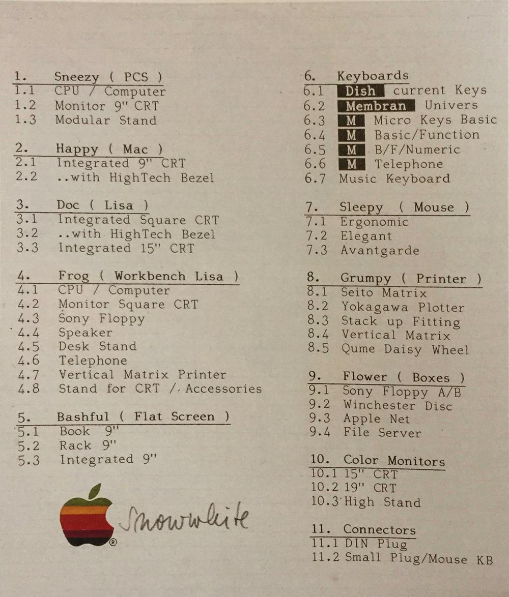
The rising number of products being developed prompted Apple to set up a strategic design process giving a coherent and unified line to all its products. The project was called Snow White and it was organized as a competition . Each product line, named after one of the seven dwarfs, aimed to explore and inspire the range of products under development. It was not intended for immediate implementation.
There were three competing teams: two international agencies and a team of Apple designers. The project was divided into three stages in which Steve Jobs and Apple designers were heavily involved:
- A draft phase in which several concepts are conceived
- A concept refinement phase
- A development phase for which more than 40 mock-ups were made.

List of products designed as part of the Snow White project.
Ultimately, Esslinger’s team won the bid (along with the $2 million contract which led to the creation of Frog Design in California!).
The Snow White project resulted in the creation of a "design language", i.e. a coherent system of shapes and signs, applicable to all Apple product lines. Applying their work to the entire range of products instead of using their previous product-by-product approach allowed designers to define and propose a formal system capable of adapting to the different types of products despite their heterogeneity (computers, keyboards, mice, printers, connectors, as well as software graphic interfaces).

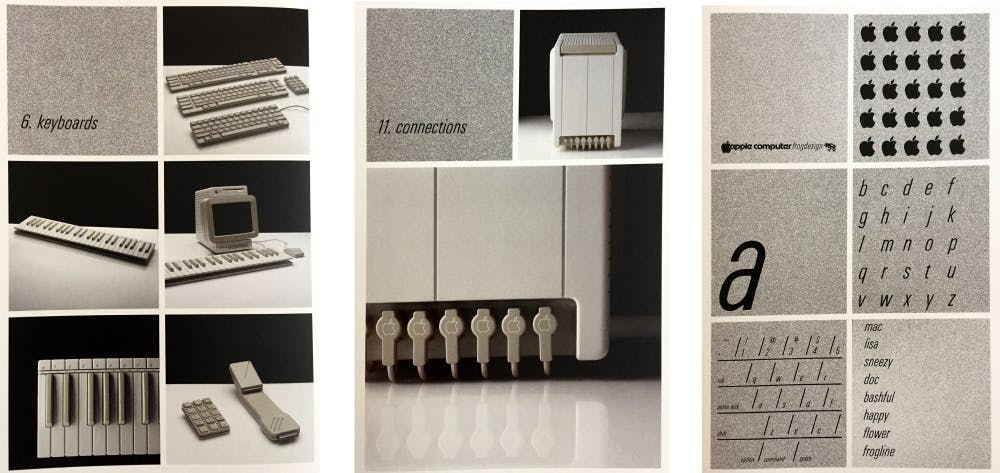
Excerpt from the presentation given to Apple management by the different Frog Design teams for phase 3 of the Snow White project (1983)

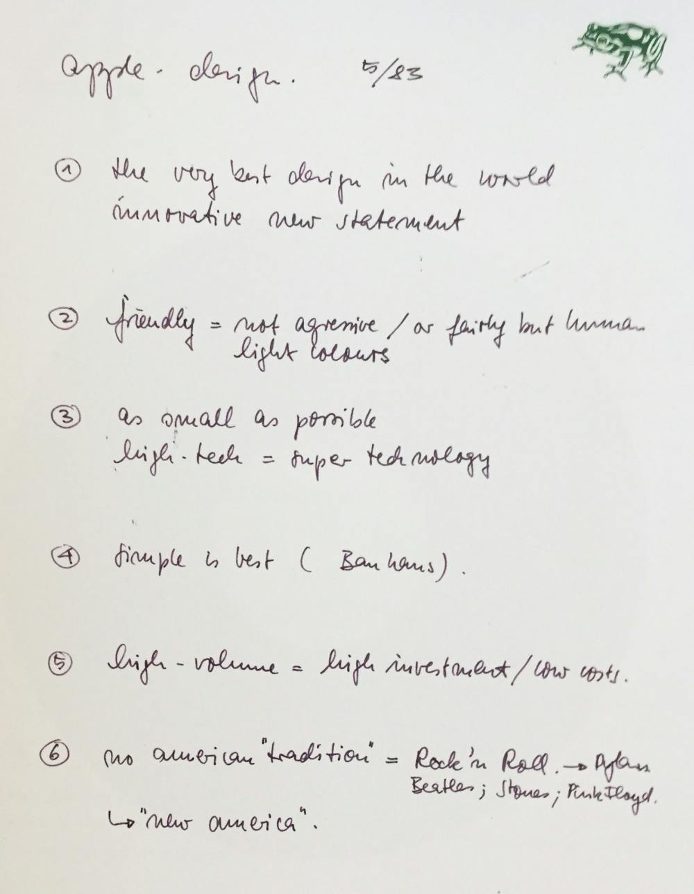
The fundamentals of Apple's "language" according to Hartmut Esslinger.
The fundamentals of Apple's design strategy: a recognizable "language”
Esslinger summarized the rules - the famous "guidelines" - that must be respected to deploy this new design. These were not strict application rules, but rather, guidelines that could steer the design of new Apple products:
- The signature look: Grooves with a zero degree draft angle, minimal surface texture, authentic materials, no paint, minimal transition angles when necessary
- The volume and size of the elements: As small as possible
- Symmetry whenever possible
- Thin lines front to back: 2 mm wide and 2 mm deep
- Colors: Off-white combined with a contrasting gray/olive green (which became “platinum” grey in late 1984)
- Ergonomics based on interactions of "real people"
- A brand: A logo with just the name of the product silk-screened in dark gray in Univers condensed italic font by Adrian Frutiger and Garamond condensed font for the product names.
The design language set by Esslinger has undoubtedly evolved. It was successively tweaked to feature the curves, colored translucence and milkiness of the iMacs, which were later enhanced by the chrome finish of the first iPhones and all their variations with round edges. These founding principles were key to the long-term development of a unique Apple design, down to the architecture of its stores, its packaging and the elements of the whole Apple experience.
But that’s not all: Design strategy = vision
In addition to establishing the core principles that make up Apple's design DNA, the Snow White project was an opportunity to research, define and shape Apple's roadmap for many years to come. With the help of the company's top engineers, and an awareness of emerging technologies (audio compression formats, for example), Steve Jobs and Esslinger outlined and then solidified a design strategy that is still relevant today. The iMac, the iPad, and even what would become the iWatch had already been imagined at the time.

Prototypes of products imagined by Hartmut Esslinger and Apple's design teams as early as 1984
So what is design strategy?
Esslinger's case proves that a design strategy is essentially a frame of reference that defines, on a conceptual and concrete level, how a brand speaks to its customers through shapes, language and visuals. It's not just a matter of creating a graphic chart; it’s about defining the founding principles that will guide all of the company's official decisions and organization. Ensuring coherence between all its elements is key.
In short, creating a design strategy means:
- Tangibly shaping the long-term product strategy through prototypes. These may include mockups of products,spaces, apps or websites, and videos showing the whole user experience.
- Establishing universal principles based on the initial standards (the “intangibles”) that will drive the design of the company’s future products.
This design strategy can be a game-changer for a company, prompting them to create an internal or external design division. Steve Jobs summed it up perfectly:
“Some people think design means how it looks. But of course, if you dig deeper, it’s really how it works.”Steve Jobs
Food for thought

Conference
Metavers: an (ir)responsible innovation?

meaningful café
Splendors and miseries of the metaverse: is a creative vision possible?

Interview
What is experience design?

Les Echos
It's time to take creative professionals seriously

Conference
Design for the "Tech for good" ! Seriously ?!

Les Echos
Lessons from Microsoft, the brilliant geek of Big Tech

Meaningful Stories
6 fantastic films about design

